Product Team
Project Overview –
Web, Mobile app
My role
- UI/UX Designer
- UX research
- Designed the entire app and website
- Product vision
Who I worked with
- 1 Front-end developer
- 1 Back-end developer
- iOS developers
- Android developers
- 1 User researcher
- 2 Product managers
Project Timeline
- 2 months for web
- 3 months for mobile
Backstory
Lumi Background
Do the things you usually do through Lumi and gain value instantly
Lumi is a payment app that incentivizes its users when they pay their bills or shop from their favorite stores. This is achieved through partnerships with different consumer retail brands.
Gamification is also employed to ensure user satisfaction and return. Users on the platform earn points that they can redeem for cash or mobile airtime, all at no cost. The speed at which you earn on Lumi depends only on how much you engage.
Background
Goal & Objective
Lumi approached me with a large roadmap, which consisted of far-reaching plans and the development of more functionalities. The primary goals were simple, an overhaul of the existing application, which was simply a survey platform where users answered surveys, and a full rebrand into a lifestyle super app for users, while still retaining past functionalities. Of course, there was also a focus on giving the app a more modern look and feel in order to attract and maintain more users. Key goals included:
- Rewarding users for paying bills and shopping
- Making it easy for users to get paid and make payments
Research
Research Insights
My primary research method was interviewing existing users, interviewing users of other payment apps to understand their pain points, competitive analysis and then general surveys among potential users.
Following feedback from respondents and general user insights, we realized:
- Sign up steps were unnecessarily long
- User experience was poor and navigating the app was extremely difficult
- The app was not visually appealing to a majority of younger users
Define
Design
Before ideating and sketches, we came together to decide on features and pages that would be more valuable for users based on the research found. We decided to prioritize key features to ensure conversions, this includes bill payments, quizzes, and shopping integrations.
Early on, I decided to limit my focus to the functionality of the app and test before proceeding to detailed designs. I also made sure to check with engineering that designs were feasible, developer-wise.
Design
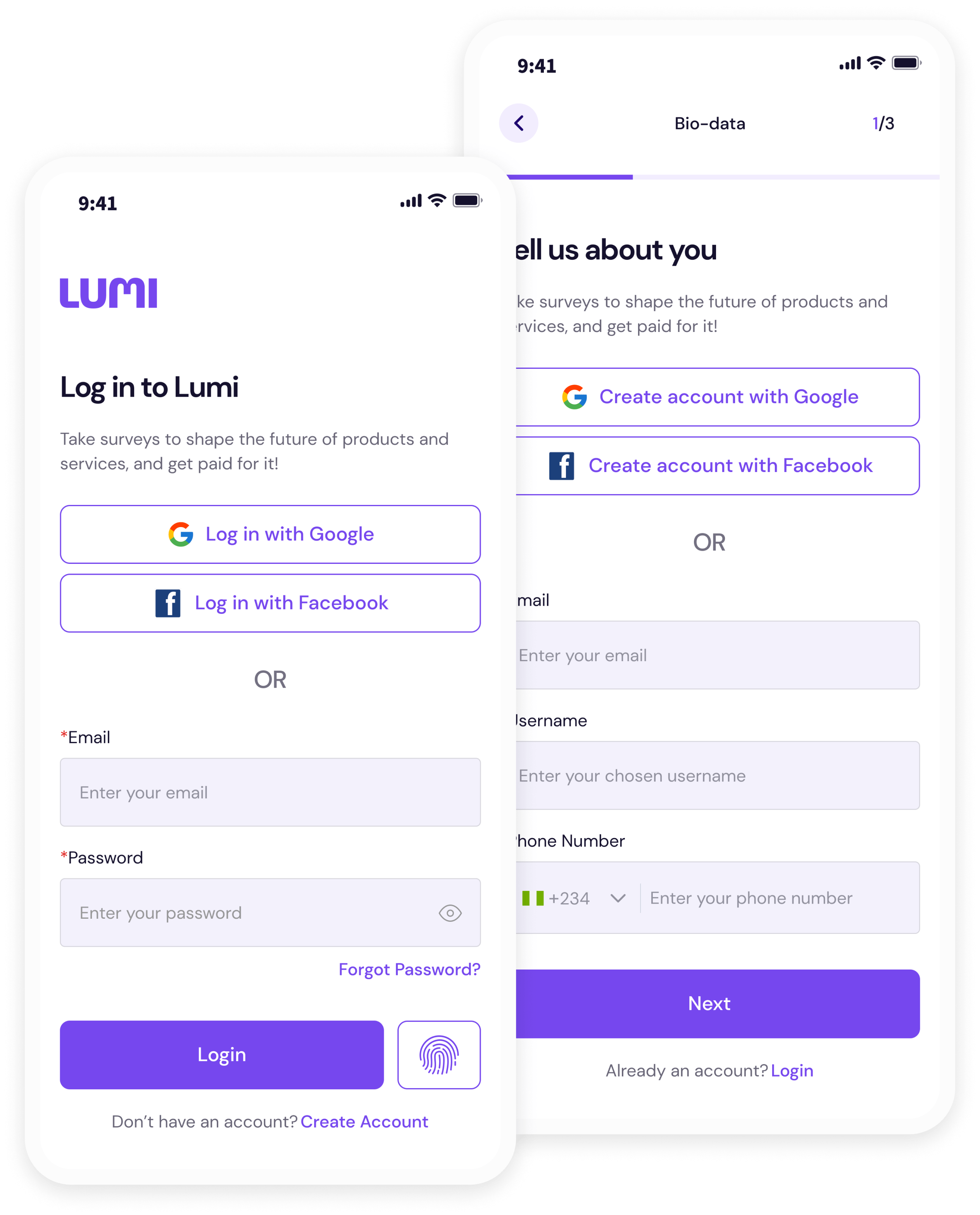
Onboarding
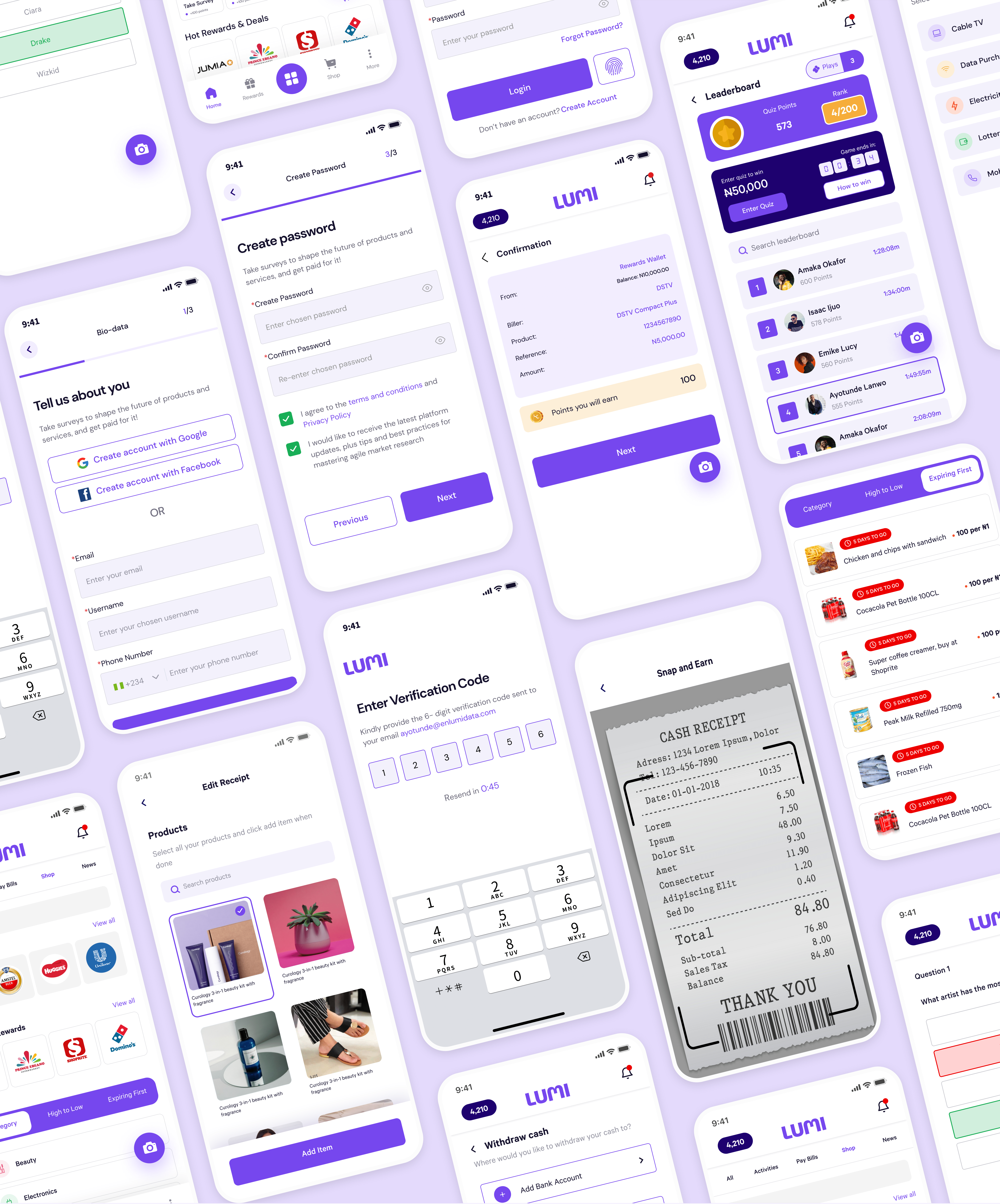
To simplify the sign-up process, emphasis was placed on providing social sign-up integrations. I also designed the flow to allow users access to the app and then after seeing the value and deciding to carry out an action, they are then prompted to create an account.
Design
Home
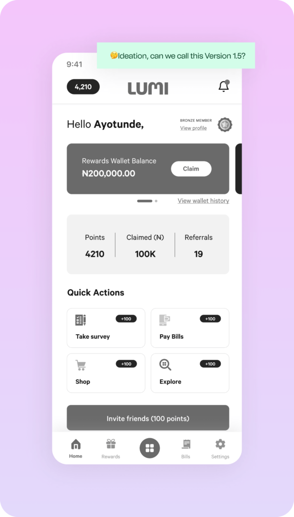
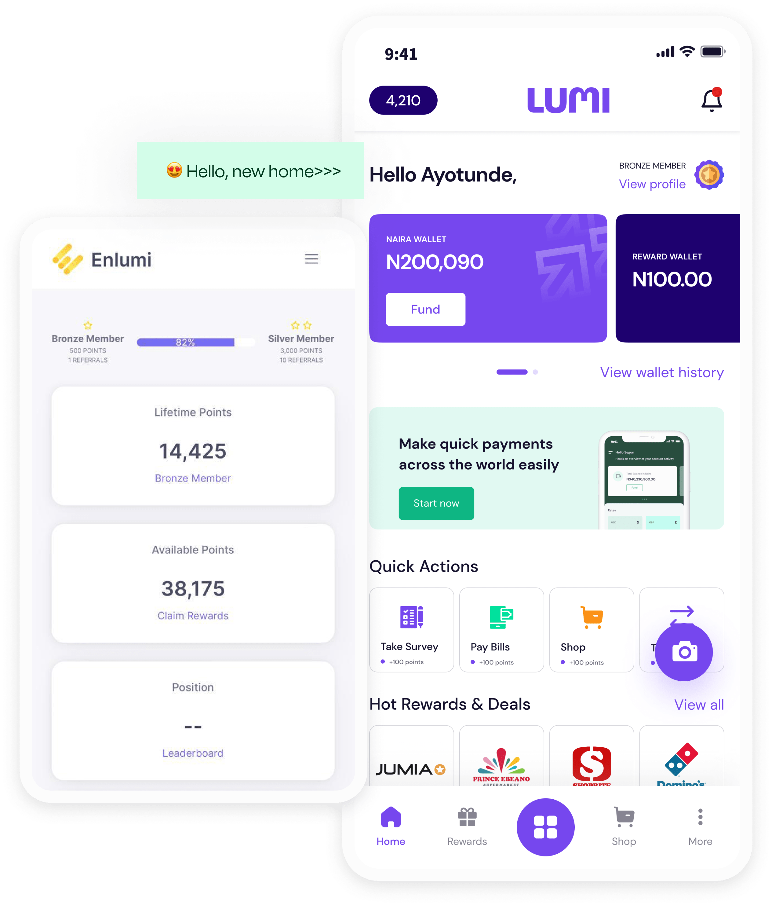
We introduced a new home or dashboard view with multiple new functionalities allowing users to carry out quick actions such as bill payments, shopping and taking surveys, accessing their app wallets, viewing recommended deals and also access their profiles.
This was a direct contrast to the previous design.
Design
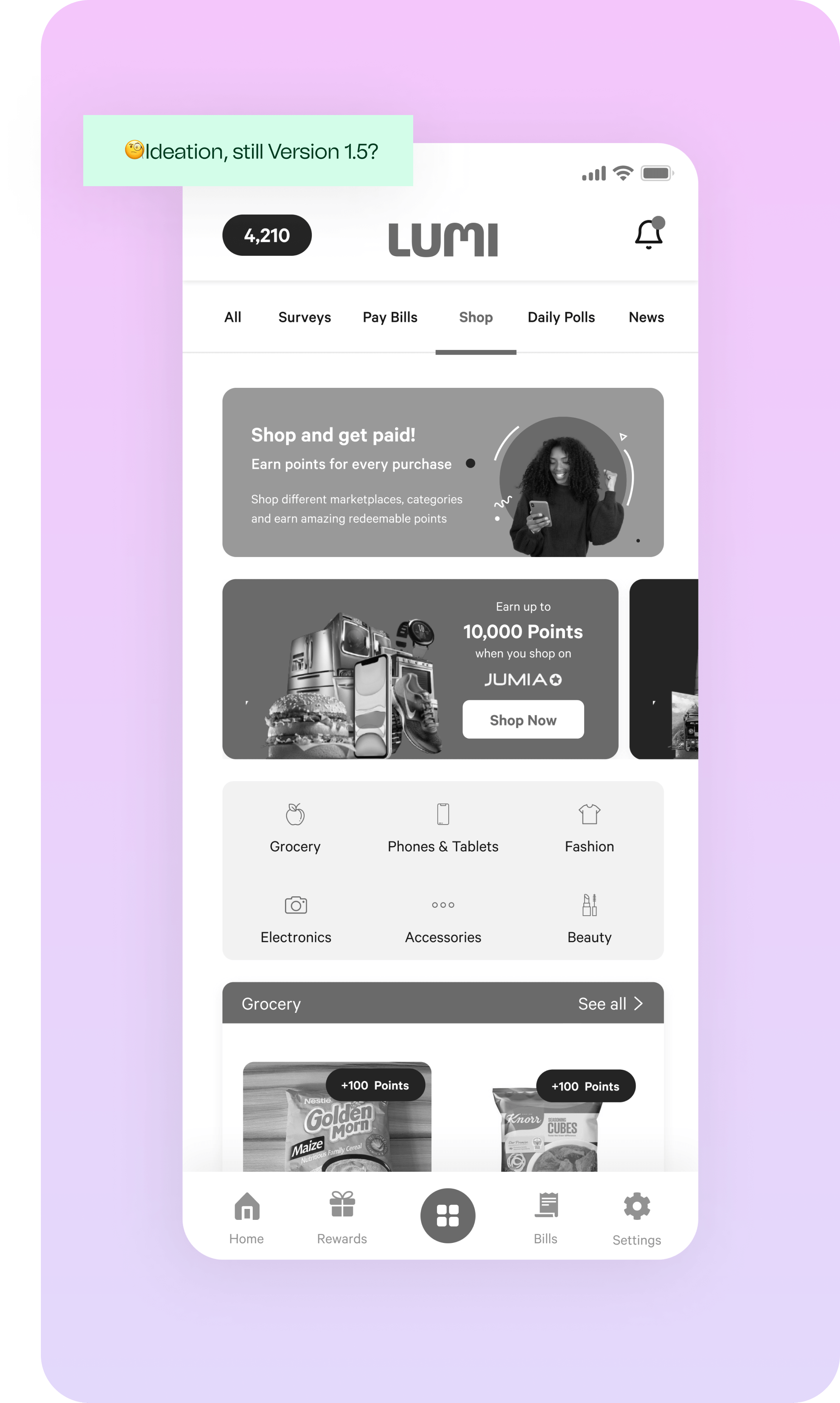
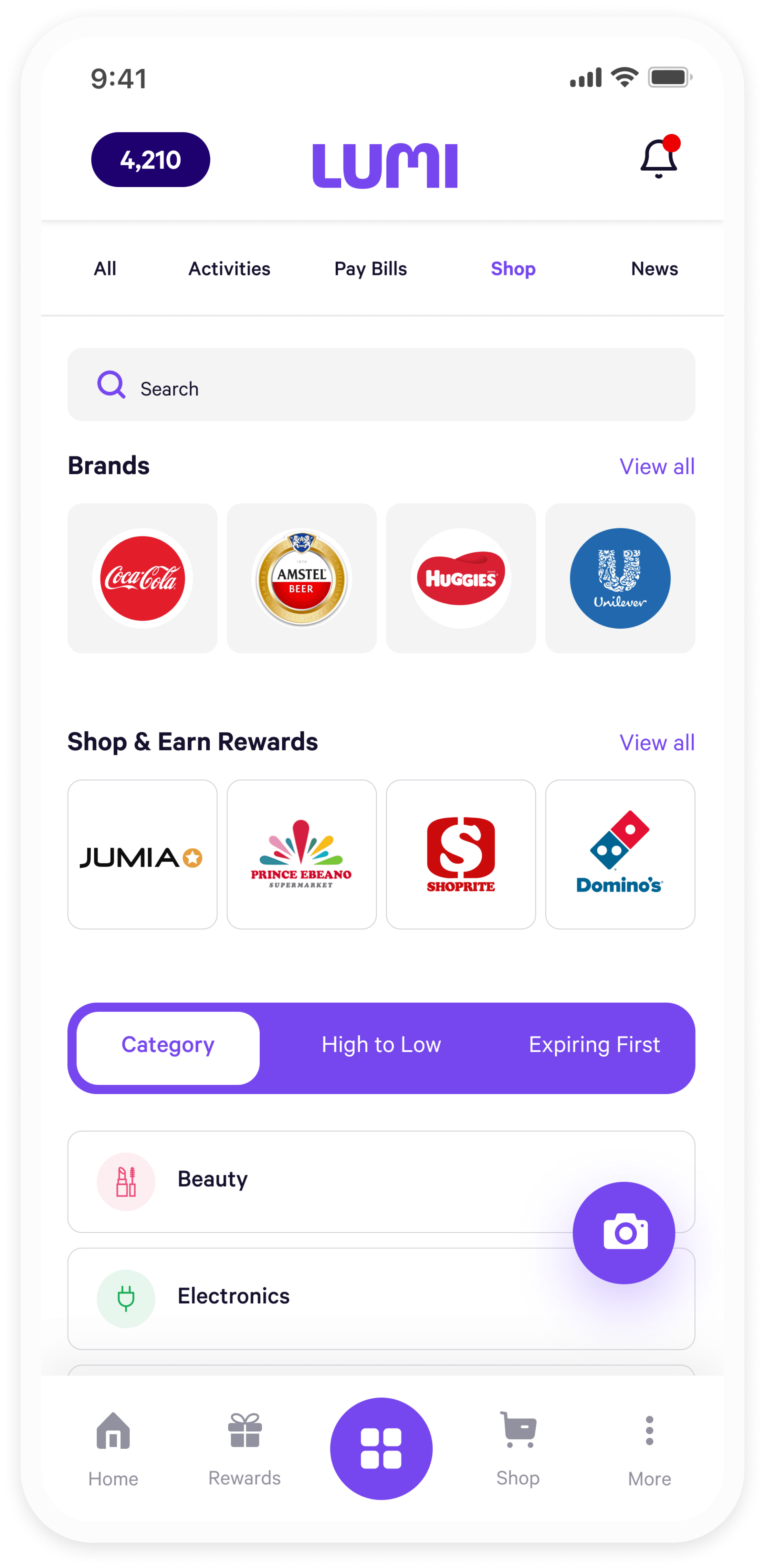
Shop
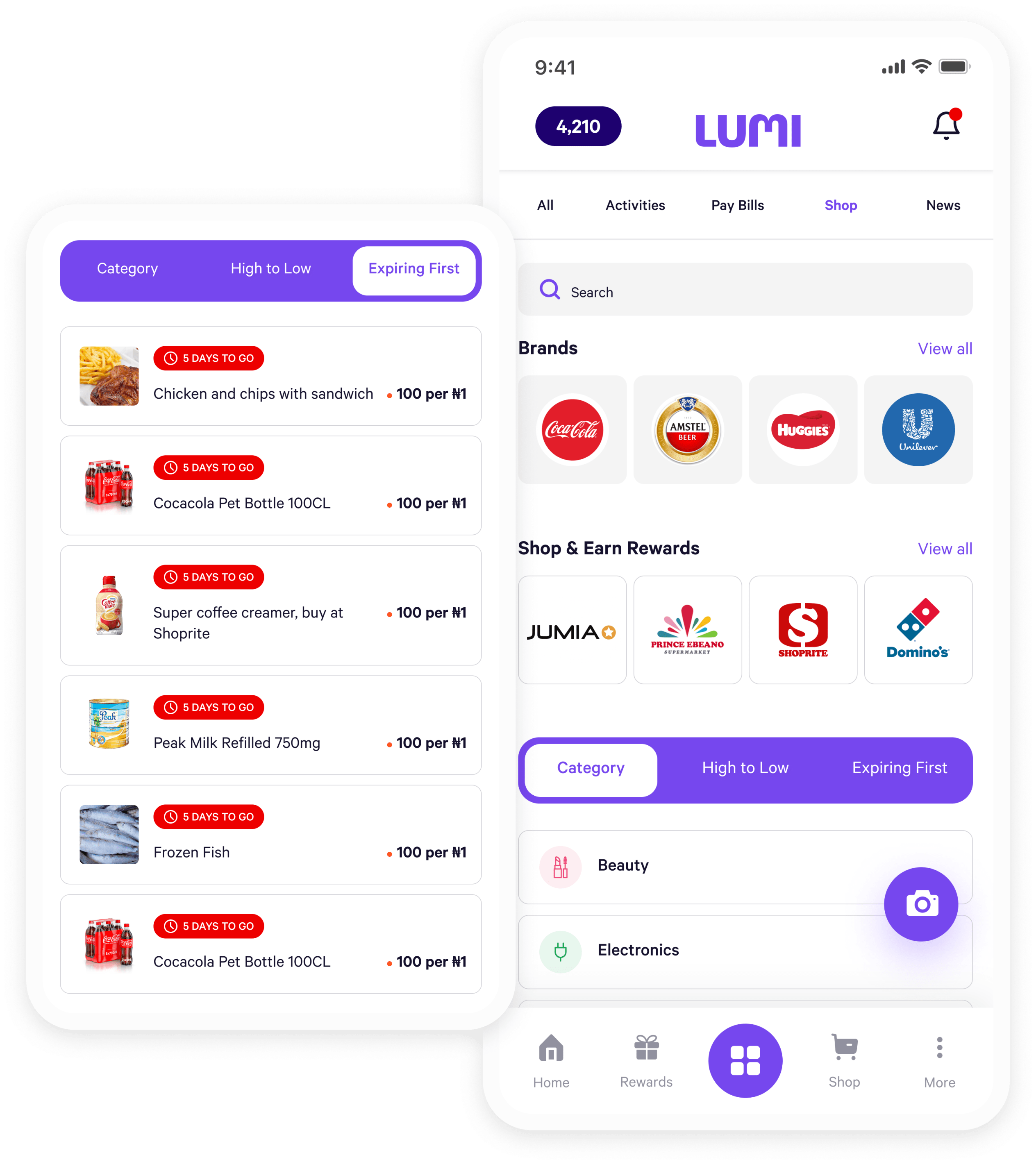
A shop feature was introduced to the app, and rather than just listing all possible products, I decided to take the approach of categorizing by brands, brands rewarding for shopping, category, highest-to-lowest prices and deals, making it easier for the user to navigate through products. As expected, a search bar was also included.
Design
Quizzes & Leaderboard
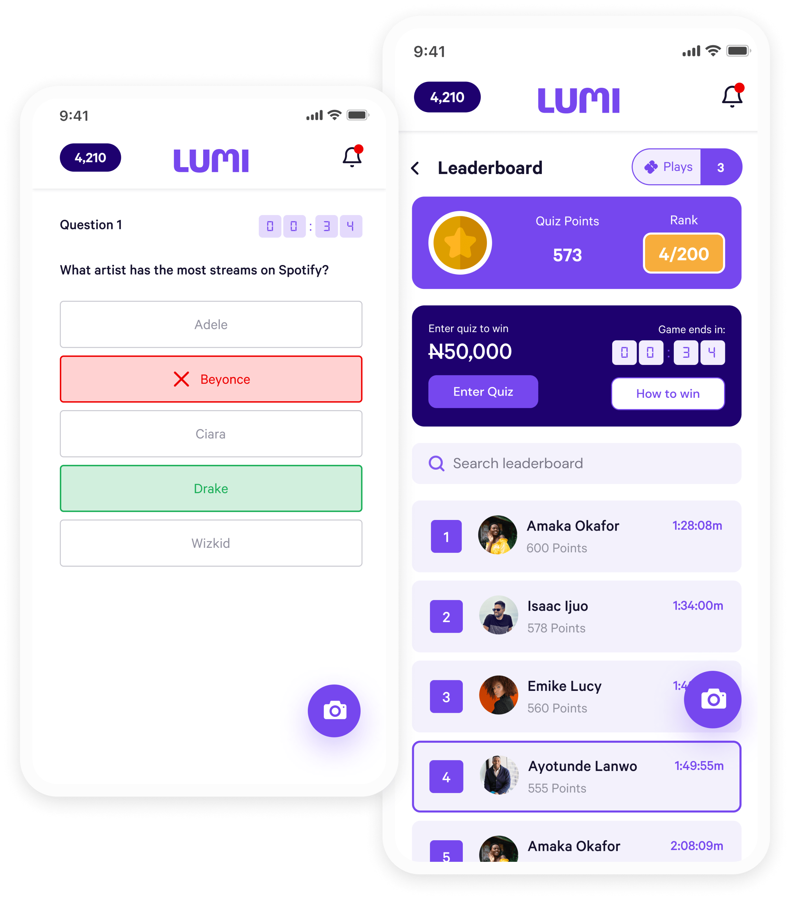
The quiz was designed to immediately notify users when they get an answer correctly or not. Users are also redirected to the leaderboard immediately after playing. In addition to the typical leaderboard design for this quiz, I made sure to include a prompt to join and also one telling the users how to win.
The Future
Takeaways & Next Steps
It was a really interesting and challenging project for me, given the scope and I was very happy with all we got done in such a limited time. I learned how important it is to interact with users early and often. Relying on our assumptions of the problems (and possible solutions) is never enough. It’s also interesting to see how even little flow changes could have such a huge impact on the retention of users generally.
- In less than a year of launch, Lumi has surpassed the 180k new users mark with over 90k monthly active users (https://techpoint.africa/2022/01/05/this-nigerian-cashback-app-already-has-60000-millennials-and-gen-zers-using-it-in-less-than-one-year/)
- Over 10,000 transactions are processed monthly
- 20k apps installed in 2 months since mobile app launch
This is something the entire team is happy with while we actively collaborate to keep maintaining and developing this product to suit users’ needs and to remain this go-to payment app.
