Overview
My role
Between August 2022 and February 2023, I led the redesign of Propine’s custody portal, an integrated digital asset custody platform that supports the management of all major blockchains and tokens, in addition to traditional fiat currencies. This Software-as-a-service (SaaS) platform allows investment firms and businesses to manage their customers’ portfolios, allowing them, to transfer, and trade different assets.
I collaborated with the Product and Engineering teams to brainstorm and share ideas based on insights from existing users and competitive analysis (User Research). Subsequently, we developed new user flows and I led the visual design efforts, working with Figma to redesign the user interfaces and interactive prototypes for testing and feedback, and collaborated with developers to ensure the project to life as designed. This redesign involved the design and handoff of web screens for the portal and a mobile interface for approvals. The main goal of this redesign was to simplify all processes while still delivering an aesthetically pleasing product, leading to increased revenue.
Backstory
Propine Background
The first independent digital asset custodian licensed by the Monetary Authority of Singapore (MAS), redefining the future of finance.
Based on user feedback, it was clear the old version of the portal was not intuitive and was generally difficult to navigate. We revamped the portal to address its lack of intuitiveness and difficulties in accessing certain functions. This involved creating user-friendly flows and clear navigation. Despite the challenge of a tight 6-month timeframe (for design and development) and remote work, we successfully delivered a redesigned application that met both the user and business needs and requirements.
Design
The Process
Following a comprehensive analysis of the collected data and user feedback, it was clear that the web application suffered from a poorly structured Information Architecture, resulting in user difficulties in accessing functional pages and completing tasks. I presented several viable solutions to enhance the Information Architecture, such as content reorganization, navigation redesign, and prominent calls to action. The product team deliberated on these alternatives and ultimately reached a consensus on an action plan to address the identified issues derived from the data and feedback. However, the more we designed interactive prototypes and carried out tests and presentations, the more we iterated till we arrived at a satisfactory and delightful solution.
Redesigning the information architecture & navigation
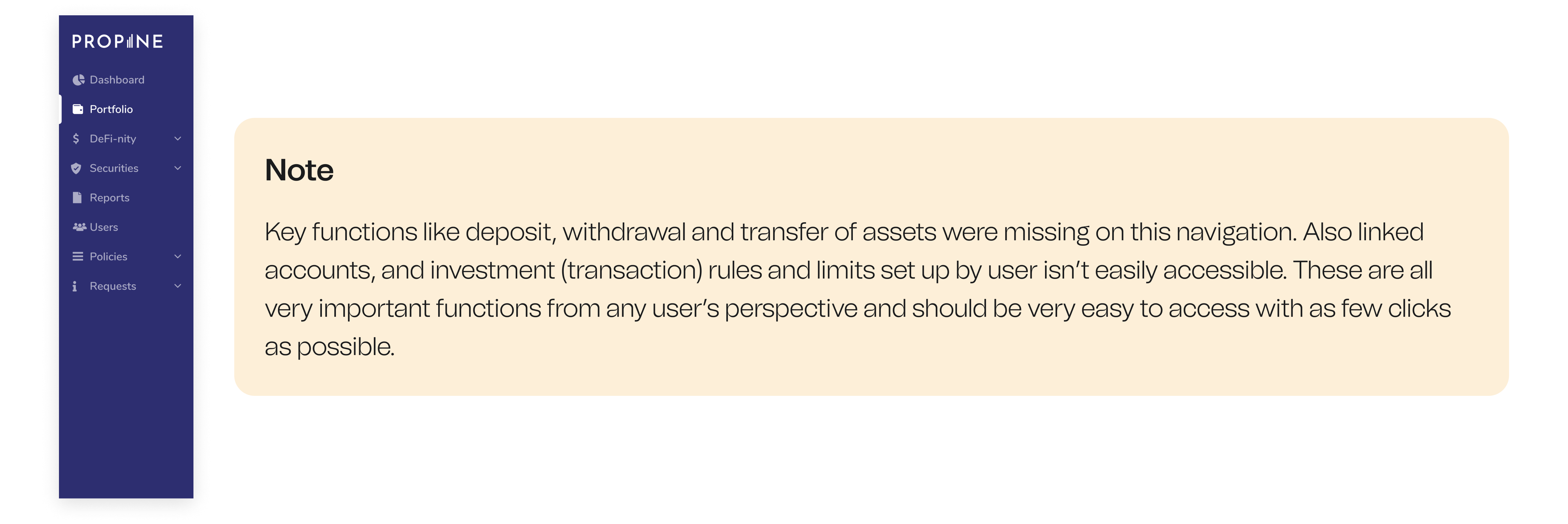
From my observation of the portal, it was clear to see why users would struggle to locate key features due to the structure of the application. In most cases, these were placed under unexpected pages and generally required a whole lot more clicks to assess.
The lack of organization and navigation within the web application caused frustration among users and resulted in a higher volume of customer support inquiries. To address these concerns, it was crucial to reorganize the information and enhance the navigation system, ensuring it becomes more user-friendly and intuitive.
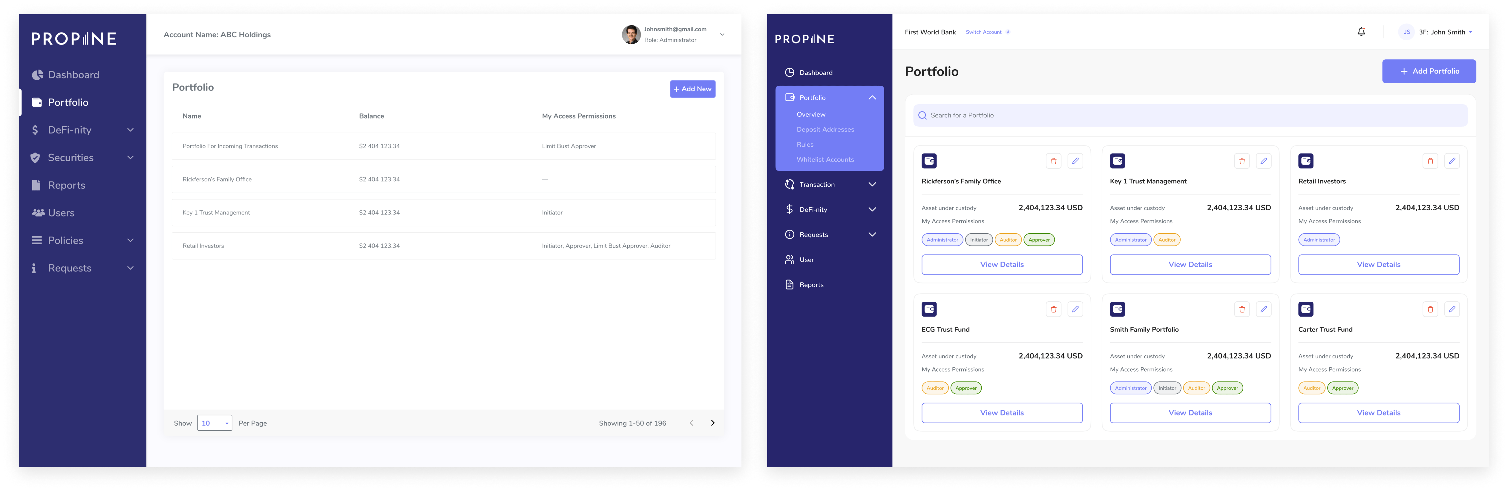
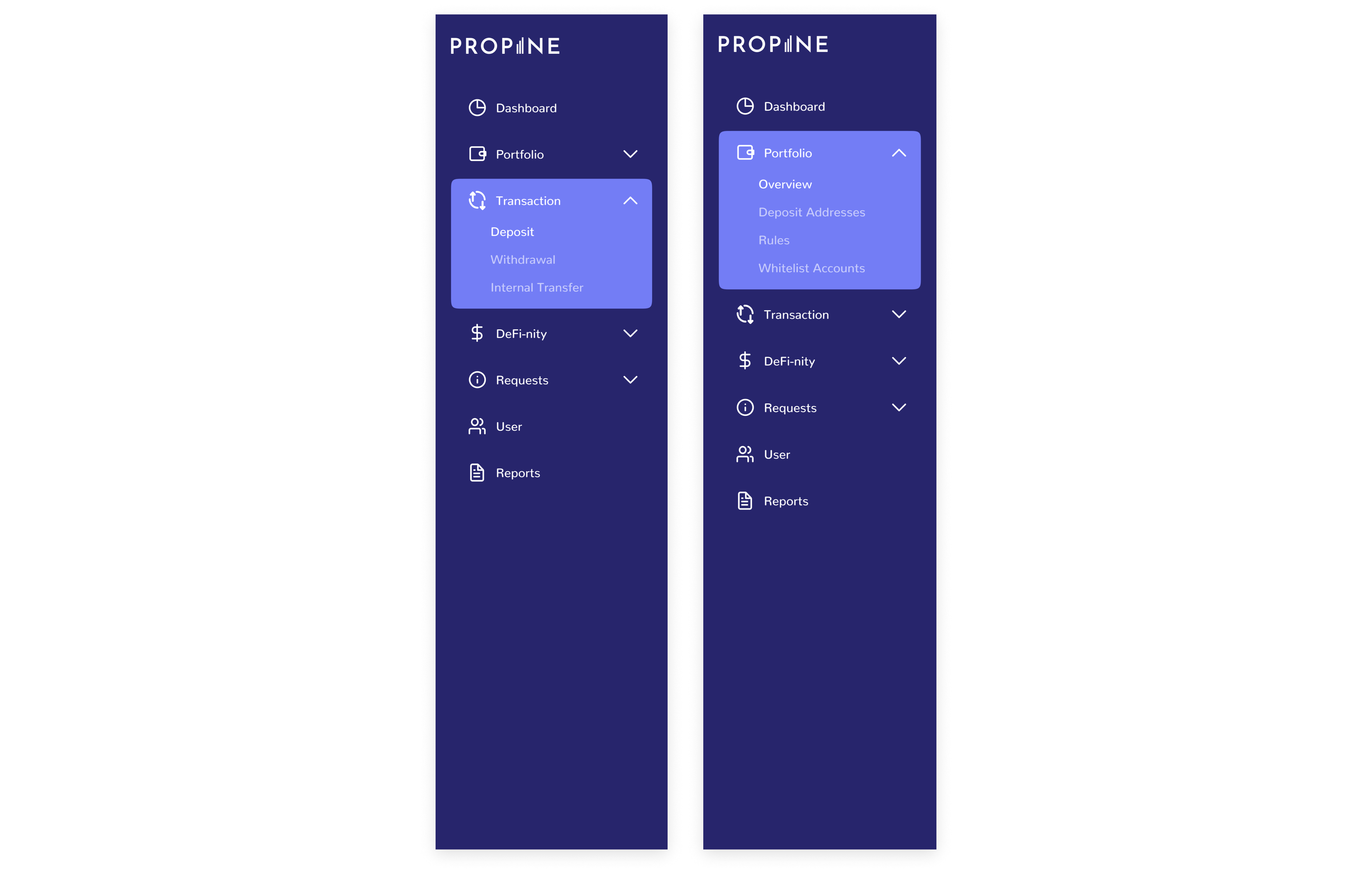
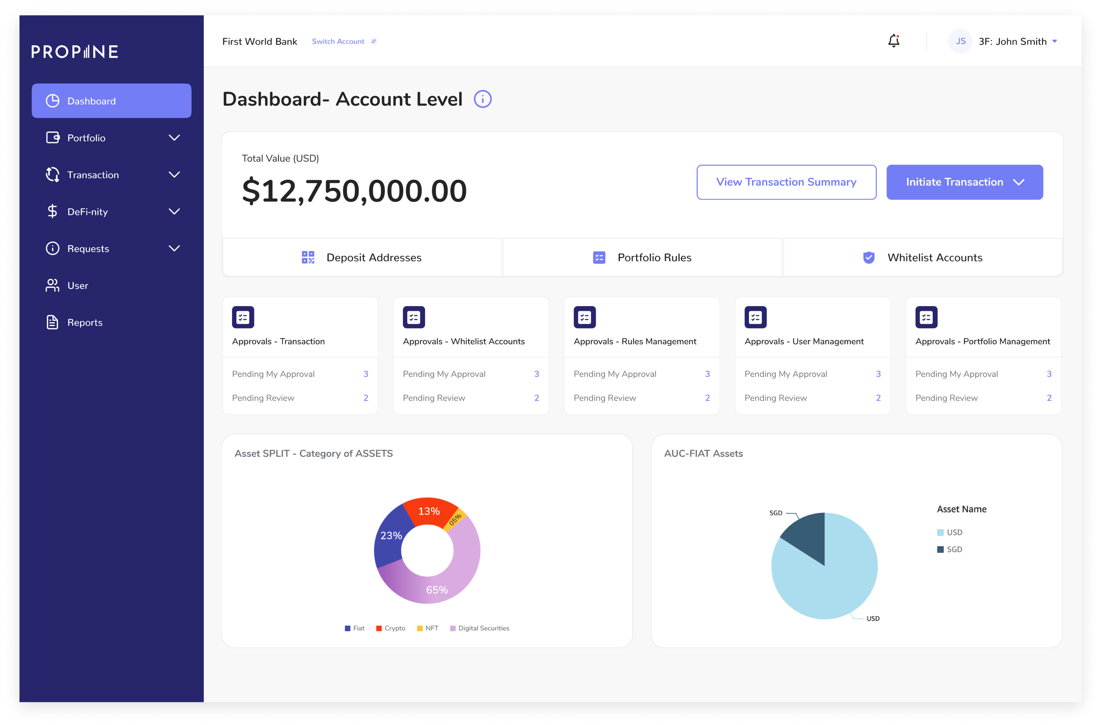
After careful analysis, I regrouped the functionalities, introducing a new menu item called Transactions which contained direct sub-menu links to deposit, withdraw, or transfer assets. I also expanded on the existing Portfolio menu to include key sub-menu links to supporting pages and all their relevant functionalities and management- Overview, Deposit Addresses (For crypto transactions), Whitelist Accounts (For regular fiat eg. $ transactions), and Rules (For setting up transaction limits and rules)
Allowing users access “Quick Actions” from Dashboard
Another problem we noticed was that most users missed essential tasks that affected the general completion of tasks as a business for themselves. Most of these were sent as notifications to them but was obviously not enough. So, we decided to include cards that basically serve as a reminder of pending approvals on the dashboard. These cards would directly navigate the users to the exact pages where their attention is required. Users are also able to directly initiate transactions from the Dashboard.
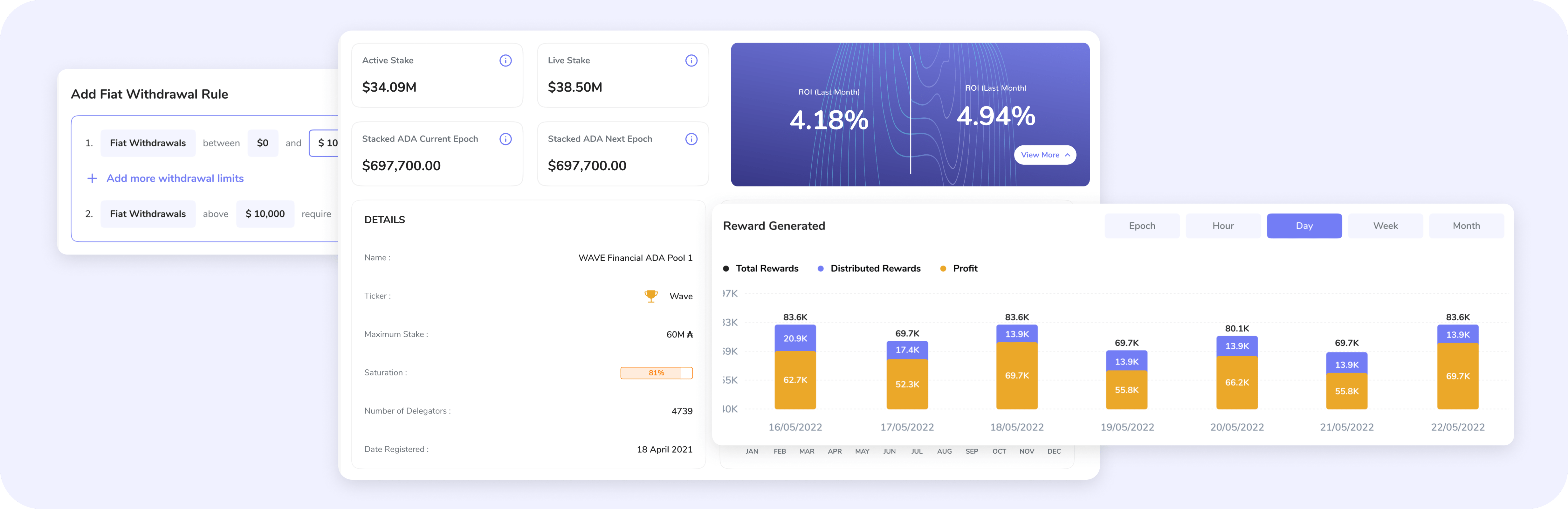
Improving how transactions are carried out
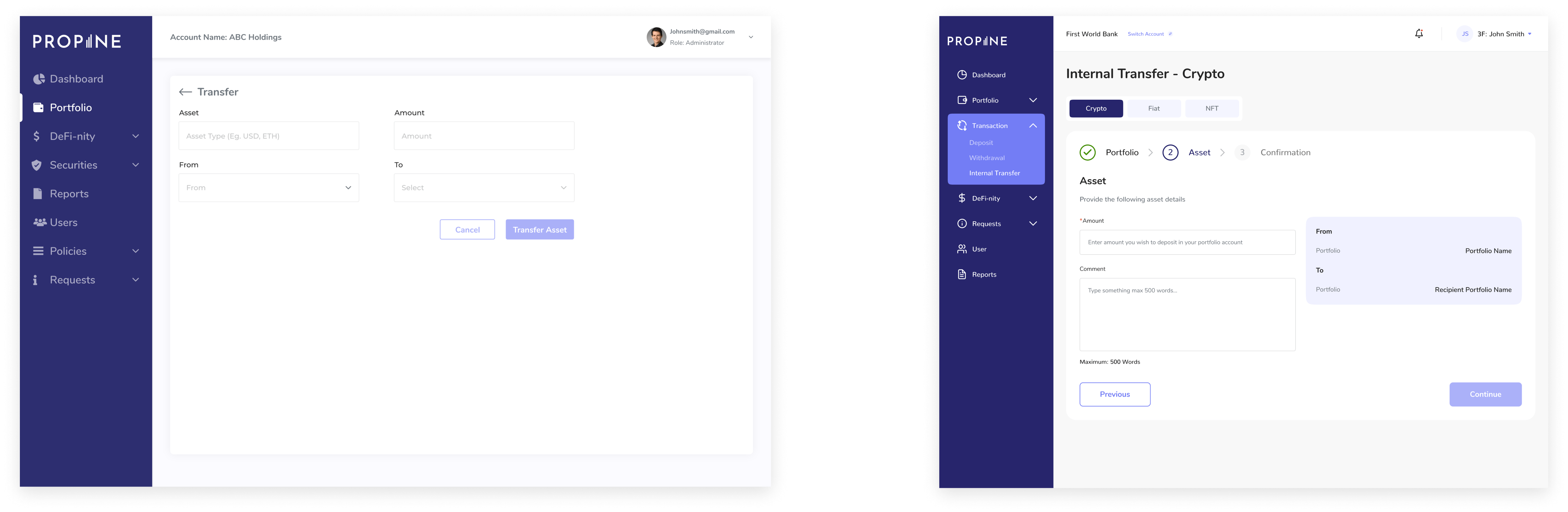
On this portal, users can deposit, withdraw, and transfer funds. These funds could be Crypto, fiat, or NFTs. All these increase the complexity, and in the old design, there was no clear differentiation, all such transactions were simply done on the Transfer page, with the entry provided by the user determining what type of transaction it is.
I decided to improve this by separating all different categories of transactions into different links, and then making use of tabs to select what type of asset is being transferred (Crypto, Fiat, or NFT). I also included a stepper to keep the user aware of the number of steps required.
Simplifying adding Portfolios and supporting rules
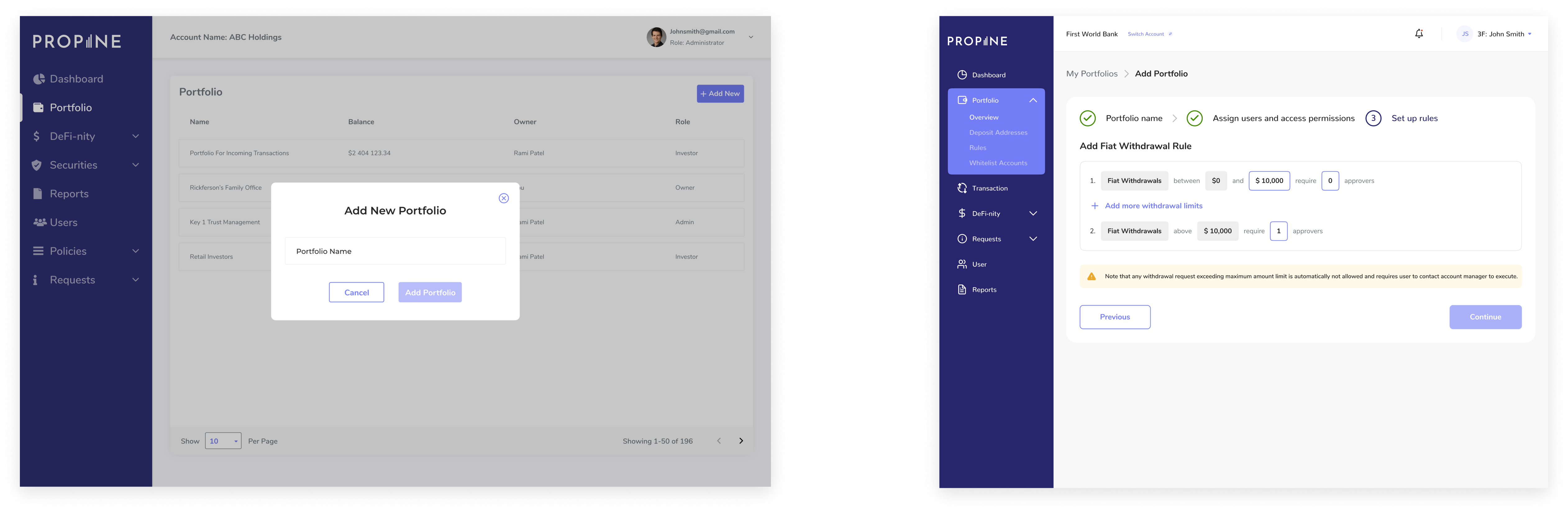
The process of setting up a new fund portfolio was not straightforward, with users being required to navigate to different sections to set up different important details. The old design flow for this was cumbersome, with the CTA to add a portfolio only triggering a pop-up for only the Portfolio name. Admin Users would then need to assign users from the user section of the app and then set up rules separately. This was very unintuitive.
I merged all these steps into one flow and included a stepper to keep the user informed about what was required to complete the process. I also included options to import already existing settings from other portfolios, giving the user options and generally offering a much improved simplified flow
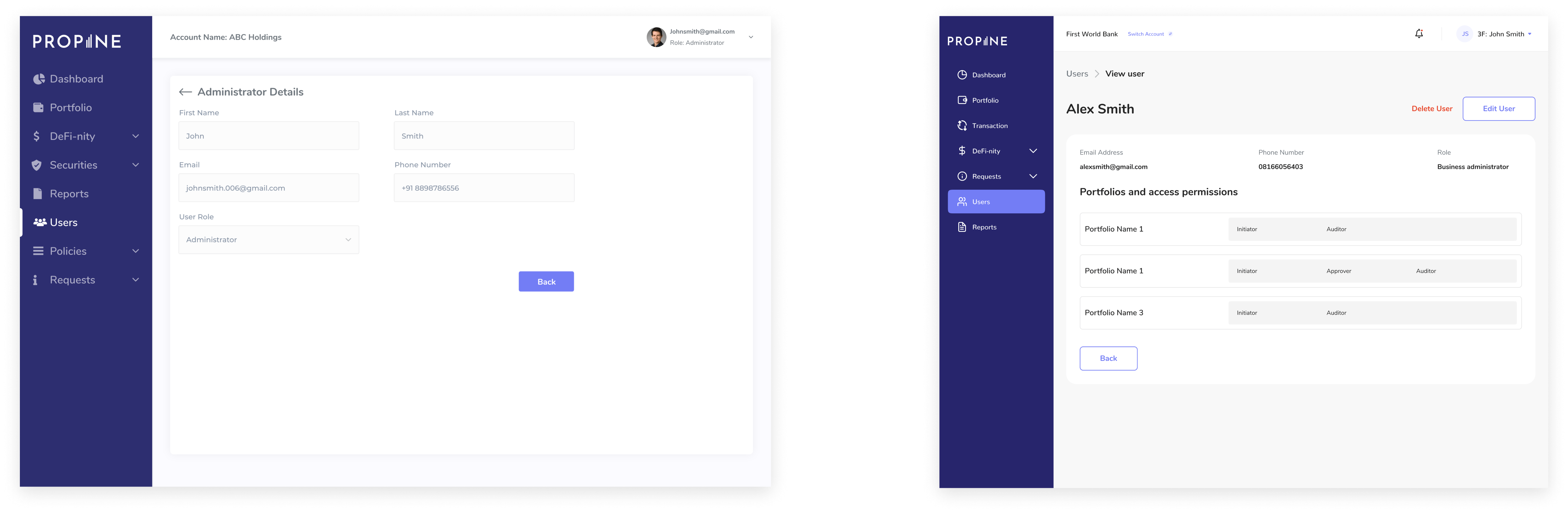
Streamlining User Management
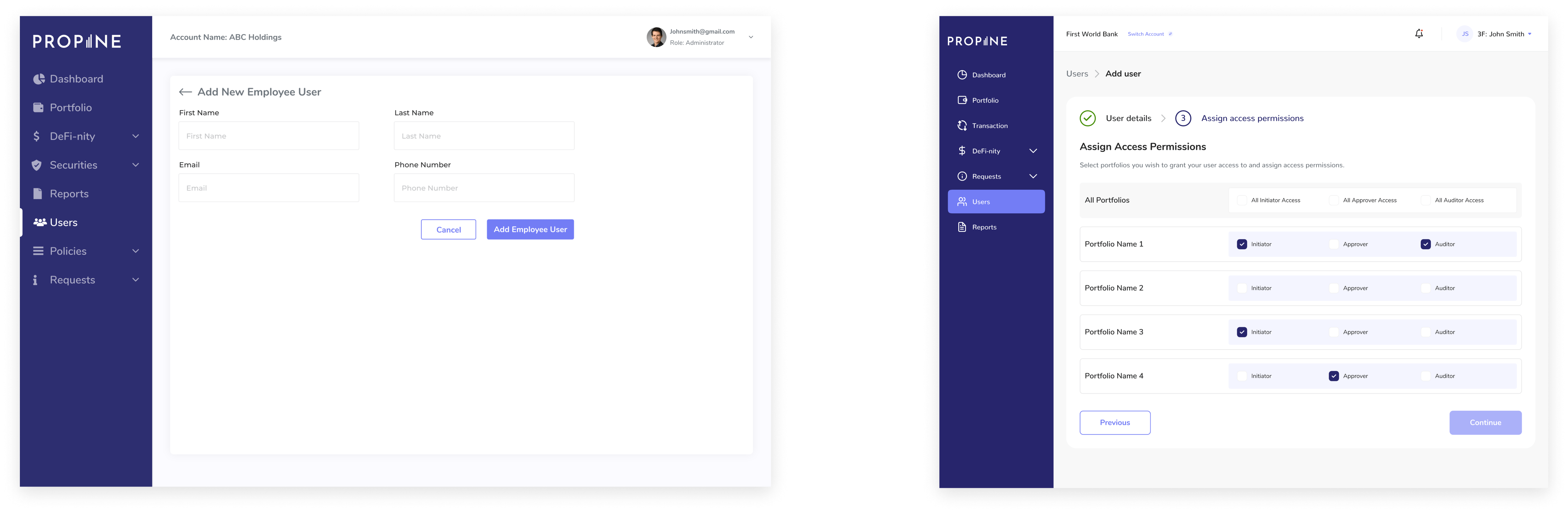
Very similar to the case of portfolio management, user management was very “scattered”, with there being a need to navigate to different sections to finish the set up. I streamlined the process of adding new users into a single flow allowing admins to add new users and assign access permissions in the same flow.
This was also applied to the management of existing users
Usability
Usability Testing & Iteration
We ran tests internally and with some existing customers, took feedback, and iterated as needed. The design team also had to keenly test implementation and ensure output was exactly as designed. The general feedback has been positive.
Detailed case study available on request.
The Future
Next Steps
Due to the positive response the redesign received, Propine went on to offer this product as a white-labeled solution for a high net-worth company. As of the time of writing this, we are currently in the process of customizing and implementing this product.