Product Team
Project Overview –
Web app
My role
- UI/UX Designer
- UX research
- Designed the entire app and website
- Product vision
Who I worked with
- 1 Front-end developer
- 1 Back-end developer
- 1 User researcher
- 1 Product managers
Project Timeline
- 6 months
Backstory
TTFCX Background
Securely delivering cross-border payments using fiat and stable coins
Problem Statement
Access to forex in Nigeria has always been a huge problem, it has become increasingly difficult for businesses and students studying abroad to access the funds they need for their fees and upkeep because of the FX shortage in the country as many commercial banks now take a much longer time to process FX demands due to the limited allocation from the Central Bank. The present policy does not allow individuals to buy foreign currency. directly from the Central Bank too.
TTFCX seeks to bridge this gap for businesses and consumers by providing a platform that allows verified users to make global payments, by simply providing their local currencies or stablecoins
Process
My Approach
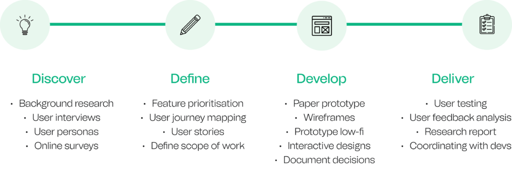
Research
Who are we building for?
Background
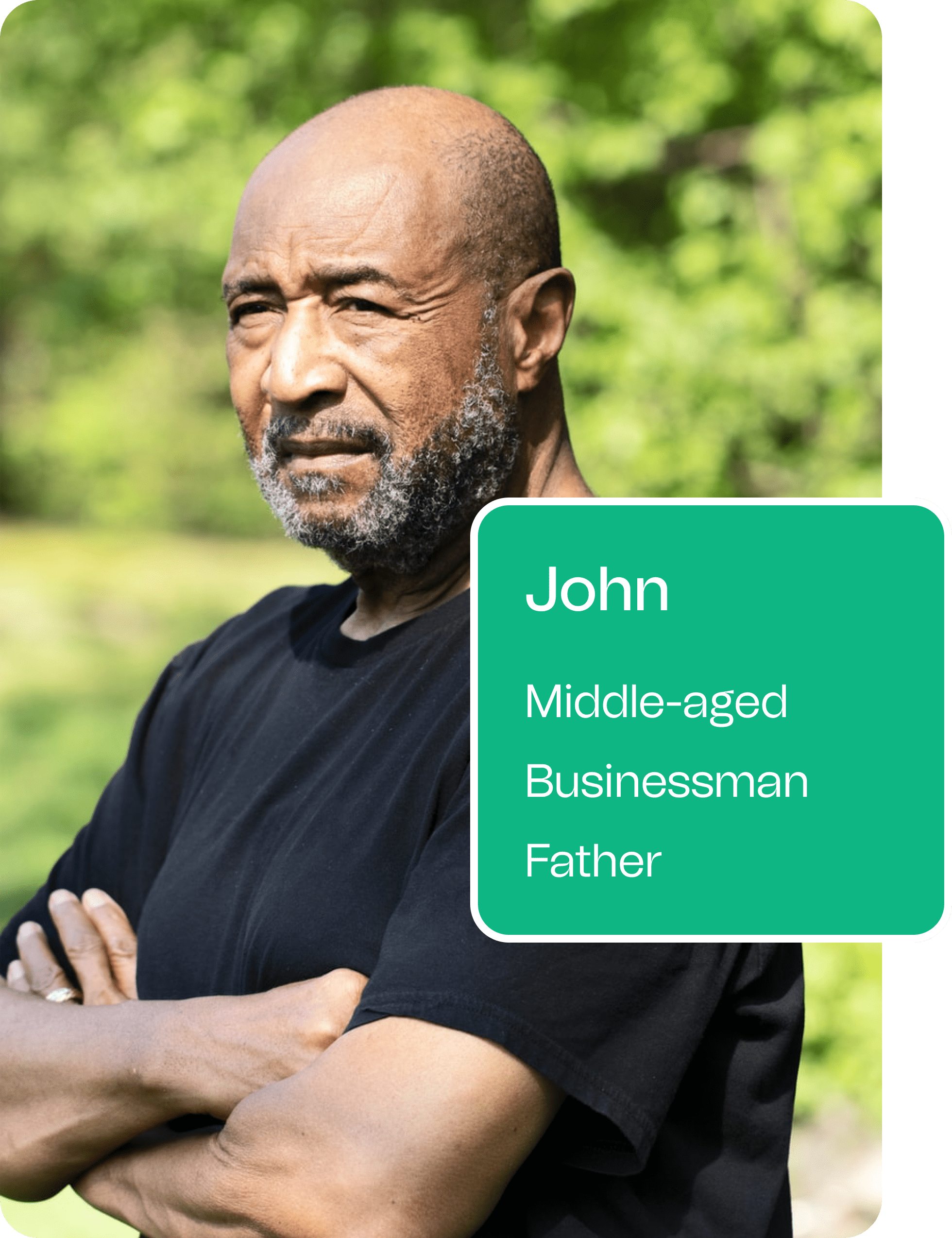
John is a middle-aged business owner who deals in the import and export of agricultural products. He is also a father of university-age children.
Goals
He wants to comfortably process international business deals as well as pay his children’s international school fees from Nigeria.
Pain points
Banks are not willing to give Raphael the forex needed to run his business and to pay his children’s tuition and living expenses in the United Kingdom.
Background
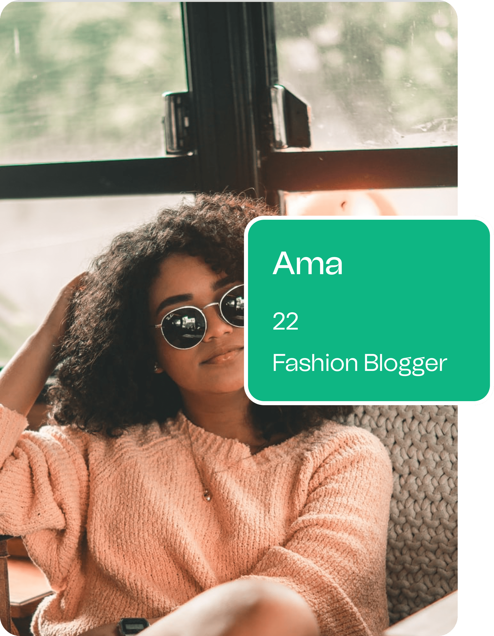
Ama is a 22 year old fashion blogger based in Nigeria who frequently shops from international brands and retailers.
Goals
She wants to be able to shop for her fashion and beauty products seamlessly and spontaneously.
Pain points
She has a monthly 30 USD limitation on her Nigerian debit card which limits her from making payments.
Research
Research Insights

Some of the insights gathered from secondary research, competitive analysis, and interviews with user personas, helped me narrow down my priorities into the following:
1
People often use such platforms without vast fintech experience, so the app should be as simple and intuitive as possible, for both experienced users and newcomers.
2
For an application like this, a lot of verification and compliance checks have to be put in place for a complete sign-up process, and to prevent churn, users must be carried along and told why every step is important.
3
Easy navigation enabling the users to easily move around the platform and immediately find what they need is of utmost importance.
4
There must be adequate reassurance for users in terms of funds security.
Define
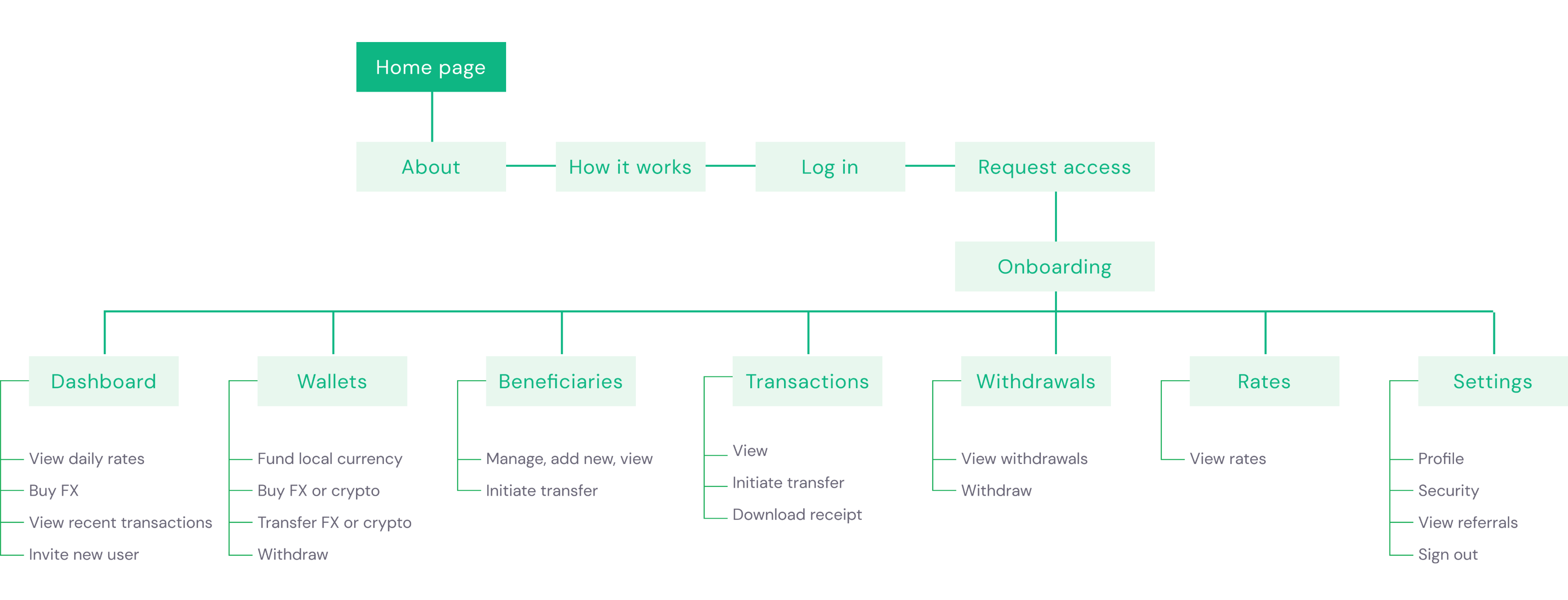
Site map
Design
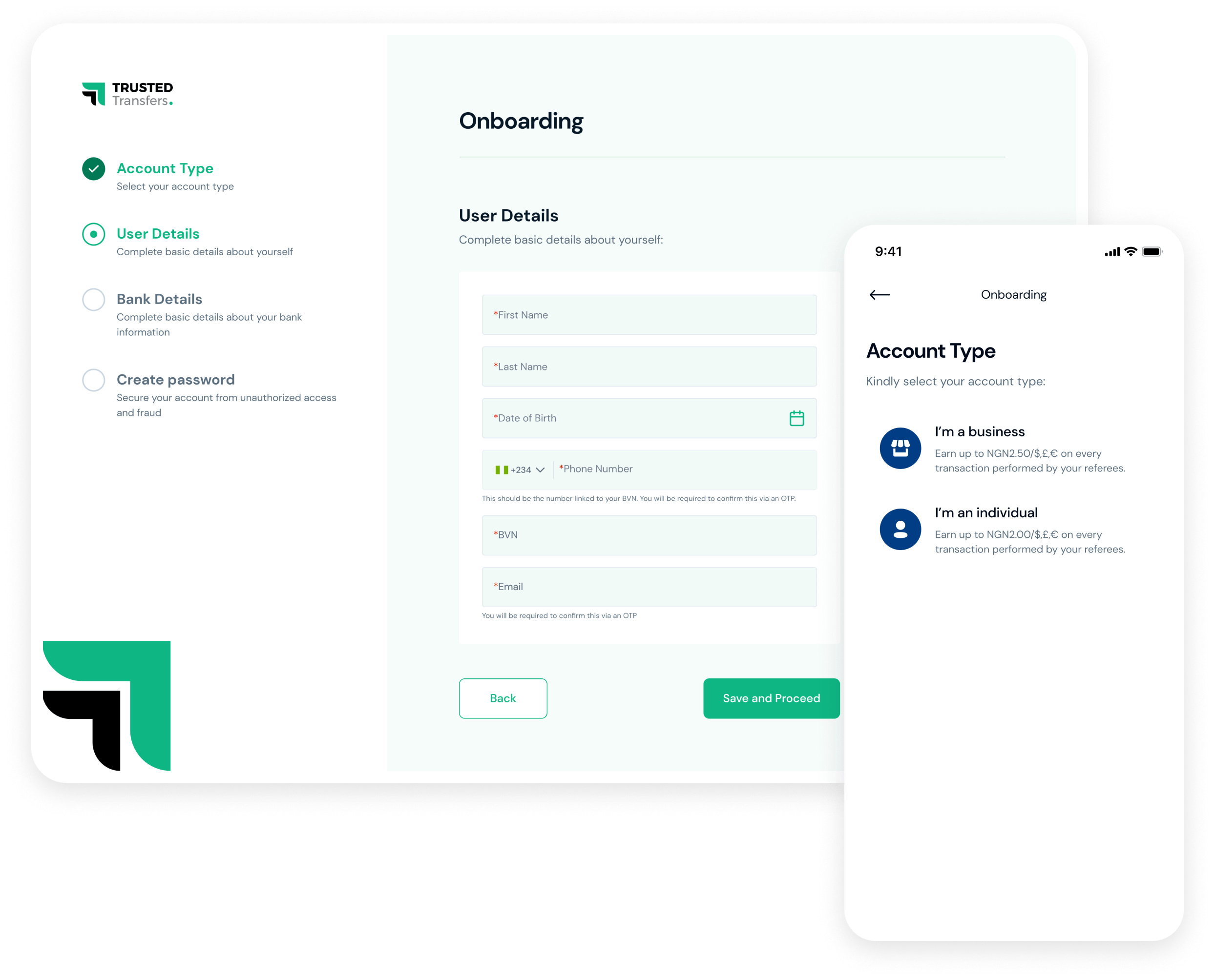
Onboarding
Since FinTech apps are quite vulnerable to hacks, there was the primary focus on security and verification, meaning that the registration process should be followed with user ID confirmation and mandatory authorization. This could be quite tedious.
I tried to prevent this frustration by providing a good onboarding experience and a streamlined signup process using a stepper and tooltips, guiding new users through their registration, and explaining why each step is important.
Design
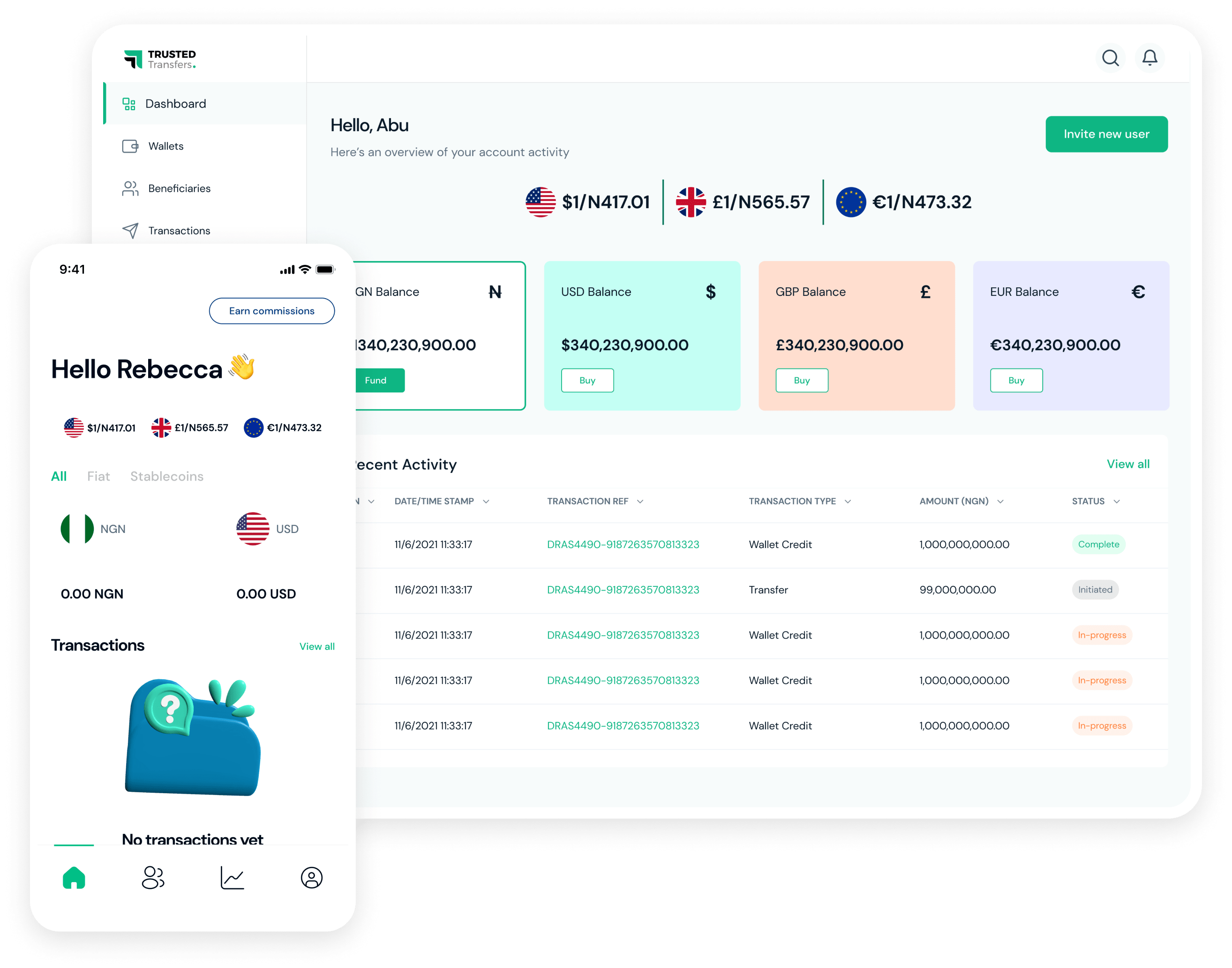
Dashboard
The dashboard allows users to fund local fiat, buy FX or crypto, view recent transactions, and invite new users. Notifications can also be viewed and accessed from the dashboard. I designed the dashboard to provide a general overview for users and also give them access to key functionalities
Design
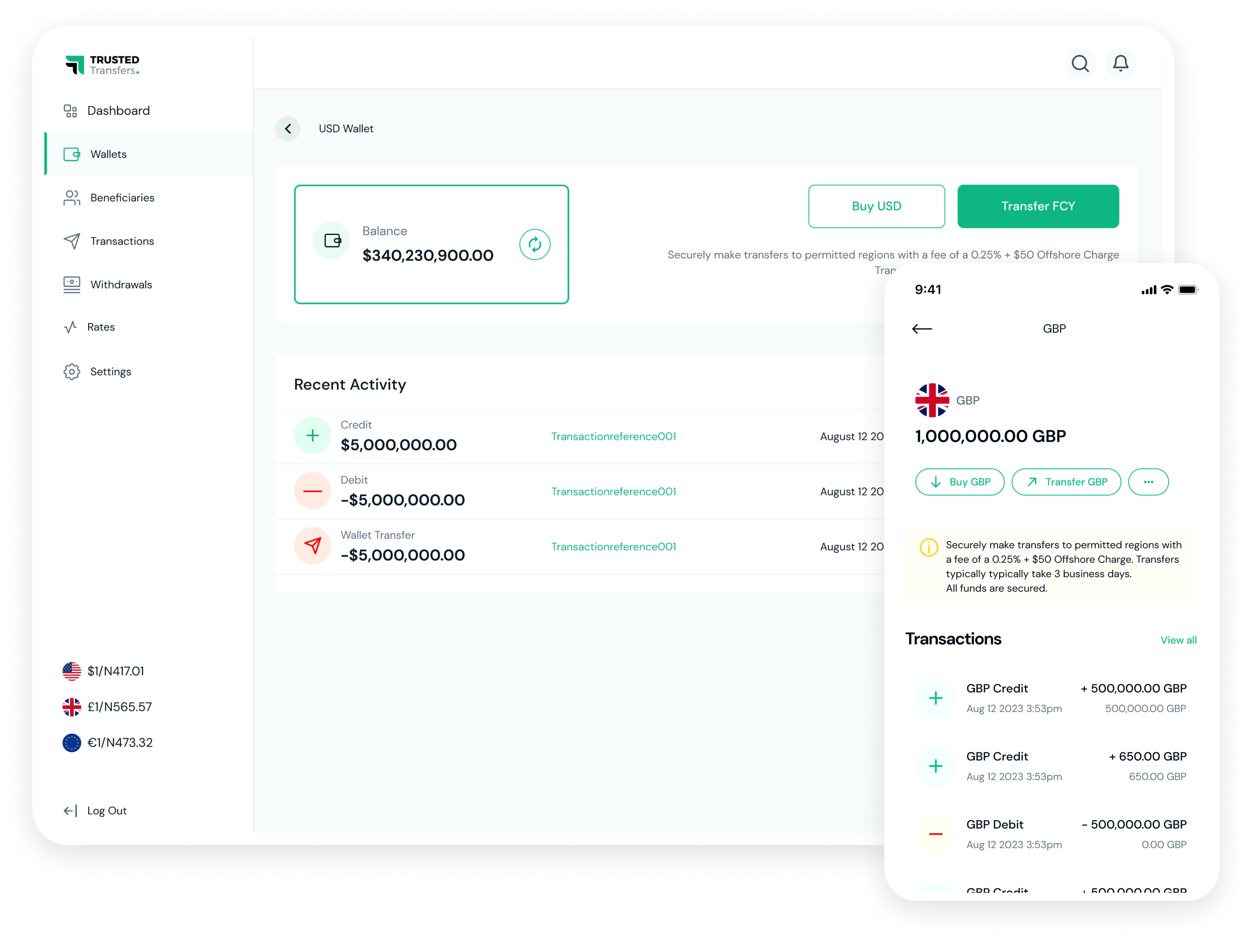
Wallets
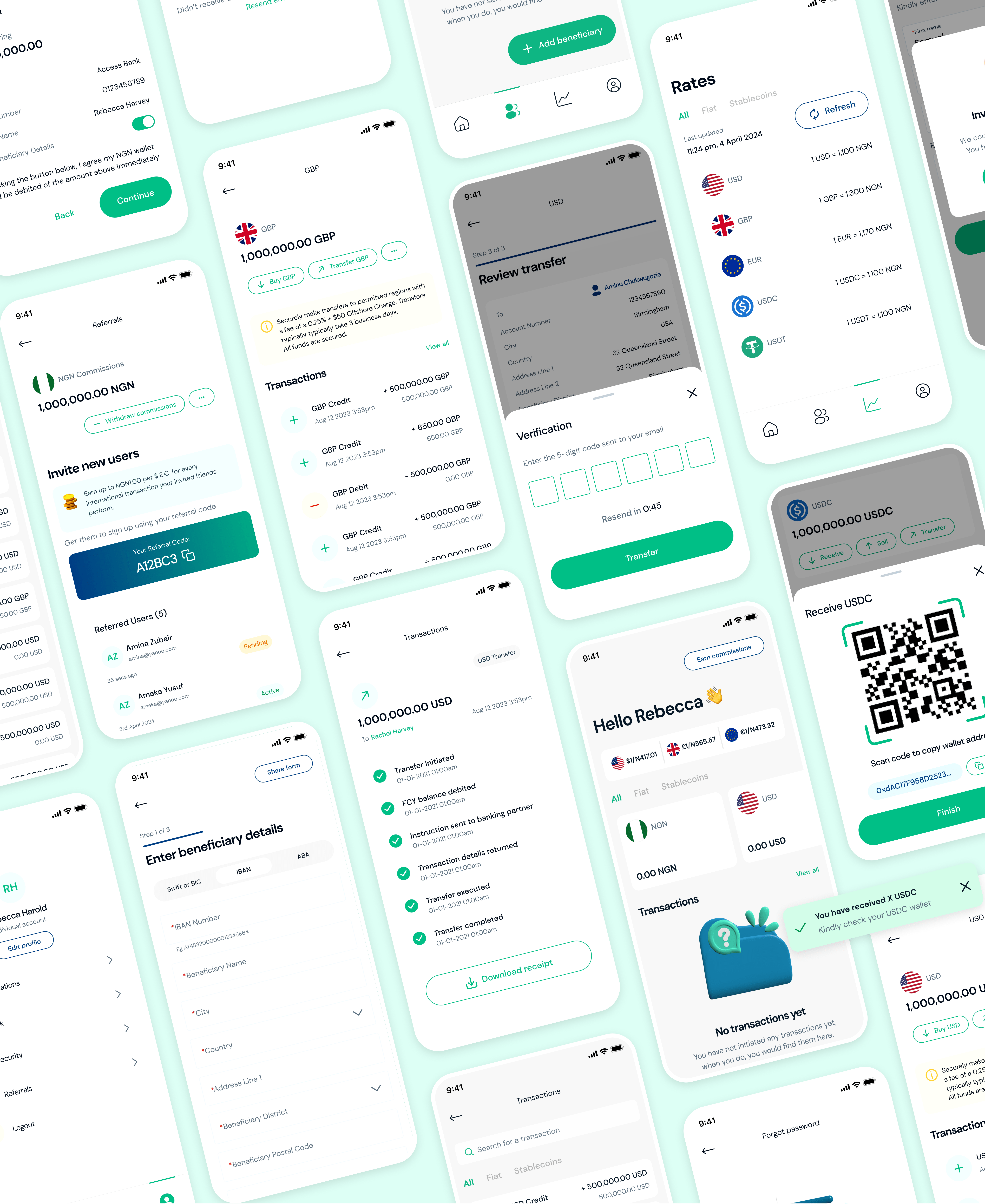
Users have both fiat (NGN, USD, GBP, and EUR) and crypto wallets (USDC and USDT) and I designed these wallets to be as intuitive as possible with primary CTAs highlighted, I also made sure to include confirmation modals to prevent errors. Key functionalities included transfer of fx or crypto, buying of fx or crypto, and a list of recent transactions.
Usability
Usability Testing & Iteration
I made sure to test my design prototypes throughout the design process. I mostly used Maze for this, and this helped me uncover any downsides of my designs long before development began.
Some key changes made after usability testing included:
1
Allowing users initiate new transactions not just from wallets, but also from transaction history, to beneficiary lists.
2
Including toast alerts in addition to regular notifications.
Challenges
Challenges & Lessons
1
Engineers/Developers were constantly being changed on the project so it delayed the delivery of designs as it took a while to understand the constraints of each person while designing. To combat designing something that couldn’t be built, I was always communicating with engineers early on to see if features were easily implementable and to simplify potential features that would take too much time to complete.
2
Due to the nature of the product, I had to prioritize security over user experience in some instances.
The future
Next Steps
An MVP and a Version 2 product have been launched, and I am currently in a product maintenance phase with my key focus being improving usability based on user feedback and continuing to fix and manage usability issues that occur.
